Thinking of interfaces as sets of jobs
What is at the core of an interface design? I think of the design not as a collection of screens or buttons or pixels, but as a collection of jobs that the user wants to do. In this article I want to give you a feeling for how to think of interfaces as made up of jobs, each with a beginning, middle and end.
Shifting our focus from visual concerns like pixels and proportions to the jobs an interface should do helps us articulate the function of each elementon screen. We can differentiate elements that make the possibility of a job known and offer the means of performing it. For example a button that says “Post a message” is the entry point for that job. We can further identify elements involved with intermediate steps of a job, or that indicate a job was completed, or suggest other jobs that the user might want to perform next.

We can think about whether a job is performed in one stroke (“delete the file”) or if it requires intermediate steps or extra information to be completed (“rename the file”). In the former case, the action will be immediately followed by elements on the screen that communicate that the job has finished and what the result was. In the case of intermediate steps, elements on the screen communicate whatever further work should be done in order to perform the job. For example a print dialog asks which of two available printers to use. It could also be that no further information is needed, but the job cannot be completed instantly, and so the interface communicates to the user an intermediate state where the software is working via a spinner.
Break jobs up into beginning, middle and end
From all of these examples we can see generally that jobs may have a beginning, a middle, and an end. This is a useful segmentation. It gives the designer a way to think at the same time about what the user is trying to doand what the interface should look like at each phase of the job. Thus ’jobs’ as units of design extend in the dimension of the screen as pixels and alsoextend through the dimension of time as processes. They are more fundamental than both.
Having understood jobs as processes that simultaneously specify user intentions and screen elements, it becomes possible to describe the design problem in an interesting way. We can distinguish two classes of design problems, a simpler one and a more complicated one. First are those problems where we know exactly what job the user is trying to perform, at what time, and under what conditions. Second, and more complicated, are those where we know a set of possible jobs the user might want to perform, but we don’t actually know which particular job they want among that set.
A one-job interface
An example of the simple one-job case is a machine for paying a parking garage ticket by credit card. There is one possible sequence of steps (we can imagine such a simple version), and every user who approaches the interface approaches it with the exact same intention: to transform an unpaid ticket into a paid ticket so they may be allowed to leave the garage. A designer making an interface for this machine basically has an optimization problem:how to take users from point A to point B with maximum clarity and the fewest points of friction possible.
Many jobs on the same screen
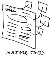
To understand the second kind of problem where a set of jobs is known but not which particular job, consider a smartphone home screen. When the user unlocks their phone, what are they trying to do? They might want to make a phone call, or check for new emails, write a text message, search for an address, or many other things. In a case like this the designer’s problem is to design not only the individual jobs, but also a portal of job possibilities.Many alternate jobs are presented as potential processes that have not yet begun. The user identifies these possibilities and uses affordances in the interface to enter into one of them. They tap ‘Mail’, wait while the software checks for new messages over the network, and then see a handful of messages appear. Beginning, middle and end. Having checked for mail and found new messages, the user again rests at a portal of possibilities. Would they like to read one of the messages? To mark one as spam? To compose a new message? To check a different mail account? Or leave the Mail app and do something else entirely?
First order and second order job problems

If you’re technically minded, you could call these “first order” and “second order” design problems. On the first order, we’re designing one job so that the beginning, middle, and end are all clear and frictionless. On the second order, we offer multiple job options at once. We’re not only designing individual job flows but also figuring out how multiple jobs can share space on the same screen, how the jobs are related, where users will look to find one versus another, which job a user will want to perform after the present one is finished and so on.

A web designer might consider these second-order problems “navigation” problems, but that makes it too easy to fall into unconscious patterns. We often assume that “navigation” is a necessary ingredient because we don’t understand the fundamental problems of offering and relating jobs to the user. As a result we fall back without thinking on patterns like tabs, nav bars, and collections of links. Focusing on the jobs and their beginning, middle and end helps us to think about what the interface really needs to do for the user instead of which patterns are the most worn and comfortable in our hand.
Putting jobs to work
How do these ideas apply to everyday work? On the first order, focusing on jobs helps us to identify each element in an interface as part of a process. We can ask of each element not only “why is this here?” but also “how did the user get here?” and “what will come next?” Is each element a stumbling block or a smooth step on the way? Looking for the beginning, middle and end of each process helps us remember to set clear expectations, remove friction from flows, and show clear results and effects when the job is done.
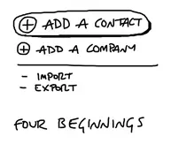
On the second order, we can become sensitive to priority and hierarchy in an interface by looking at how jobs coexist and compete on the same screen.Four links treated equally suggest the designer could only call even 25% odds on the job you want to perform. On the other hand a big button with a small link below makes a statement about which job the designer thinks you want to do (or what they wish you would do in the case of a checkout process.)
As interface designers, it’s important that we not only put buttons and text together, but that we put them in the right place, at the right size, in the right moment at the right time. These decisions are only partly visual and partly artistic. At their core should be an understanding of what jobs the interface fulfills and how those jobs intertwine in both the product and the users’ lives.
Related: Part One of my PeepCode video includes a number of segments where I talk to Geoffrey about the beginning, middle and end of each task. You might like to check it out for real life examples of jobs in the design process.